The Search and Kiwi Editor Pages Are Now Part of the Revamped User Interface
Revamping Search & Kiwi Editor
Another Milestone for the Revamped User Interface, now for the Search and Kiwi Editor pages.
We also reduced the number of open issues related with the revamping of the user interface.
Thank you for all the reports, please keep them coming!
This is part 6 of a series of posts about revamping the user interface of OBS. We started off with the Package pages in October 2018, moved on to the Project, User and Group pages in December 2018, continued with the Request pages in February 2019 and migrated the Configuration pages in March 2019. We then finished the Maintenance pages in April 2019, the Search and Kiwi Editor pages were completed in May 2019. In June 2019 we focused on the Cloud and Monitor pages. The whole migration was finished in September 2019, bye bye bento!.
Search
The Search page was split in two. This aims to improve the usability by clearly having a search for projects and packages on one page while on a new page, a search based on issues which is under the Issues tab. Some filters were moved from the Advanced section to outside.
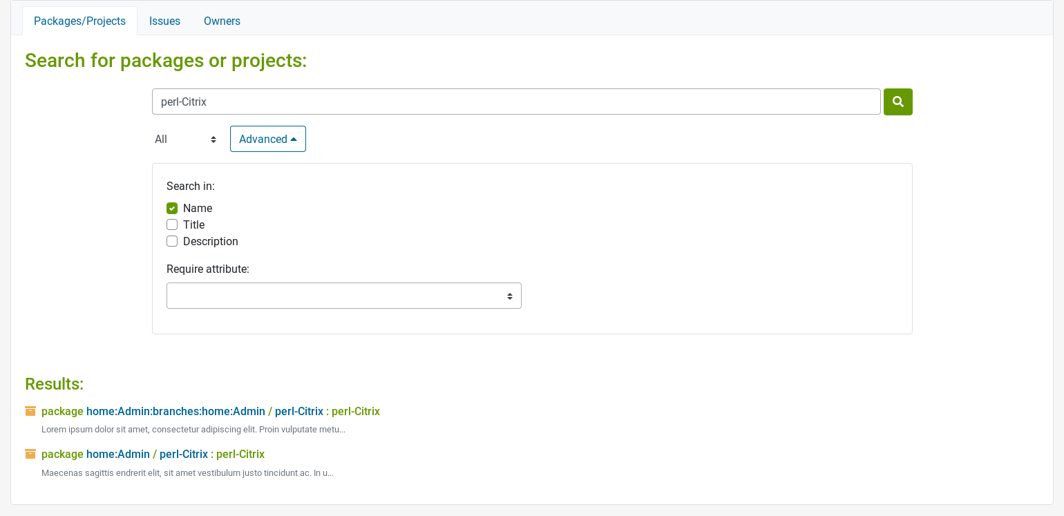
The Search Owner page has also been improved. The maintainers/bugowners are not displayed as a simple list anymore. Their avatar is more prominent and their name/login can be easily copied. It’s also easier to contact maintainers/bugowners, which is now only a click away with the new email links. The form is now more intuitive, with filters directly displayed under the search box. Oh and of course, this page is also responsive.
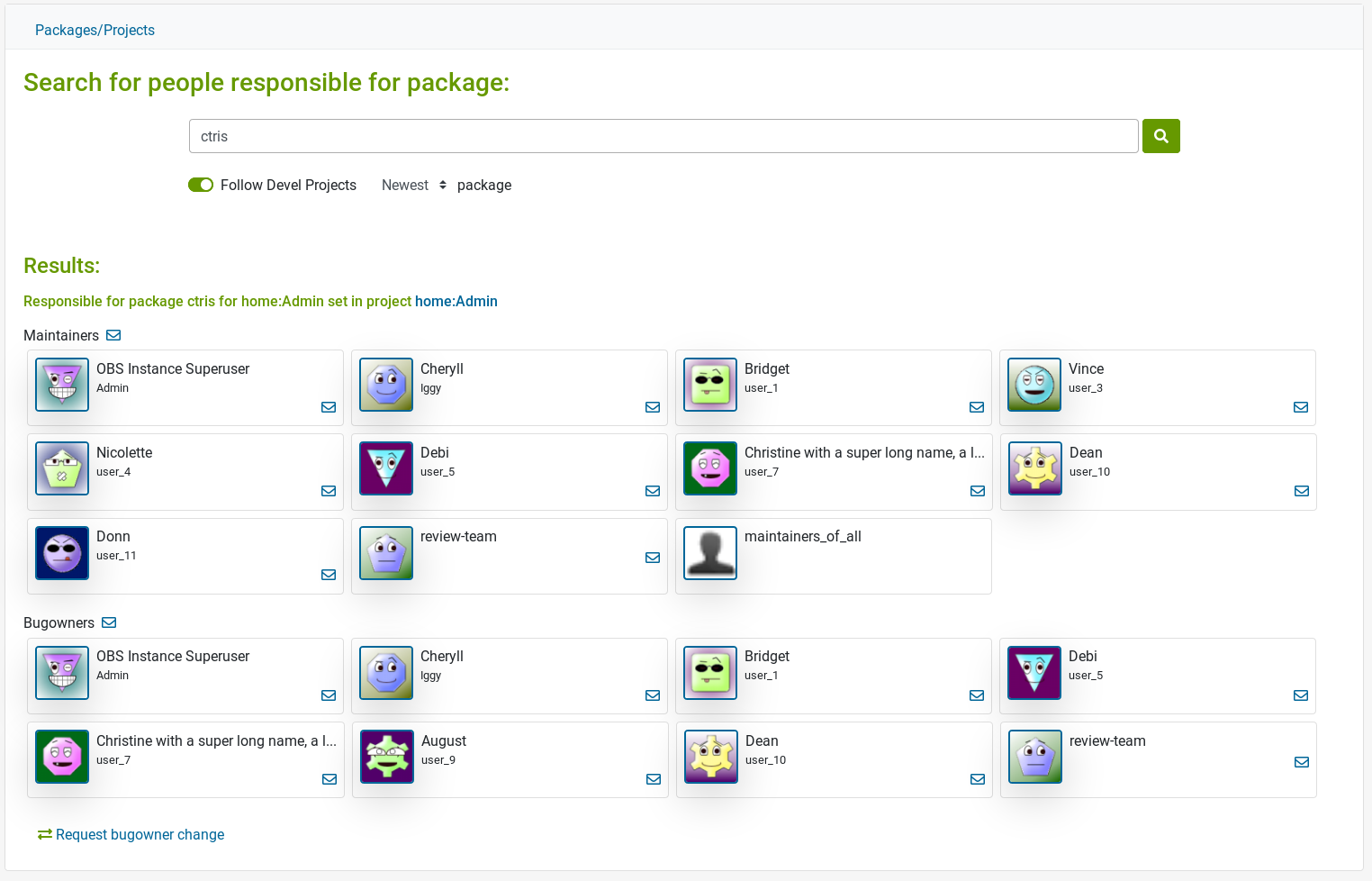
Image Template
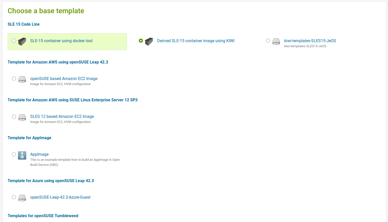
The Image Template was also moved to Bootstrap. For those who don’t know about this functionality, we provide a list of pre-configured image configurations which for the most part, are based on the various openSUSE and SUSE distributions.
Kiwi Editor
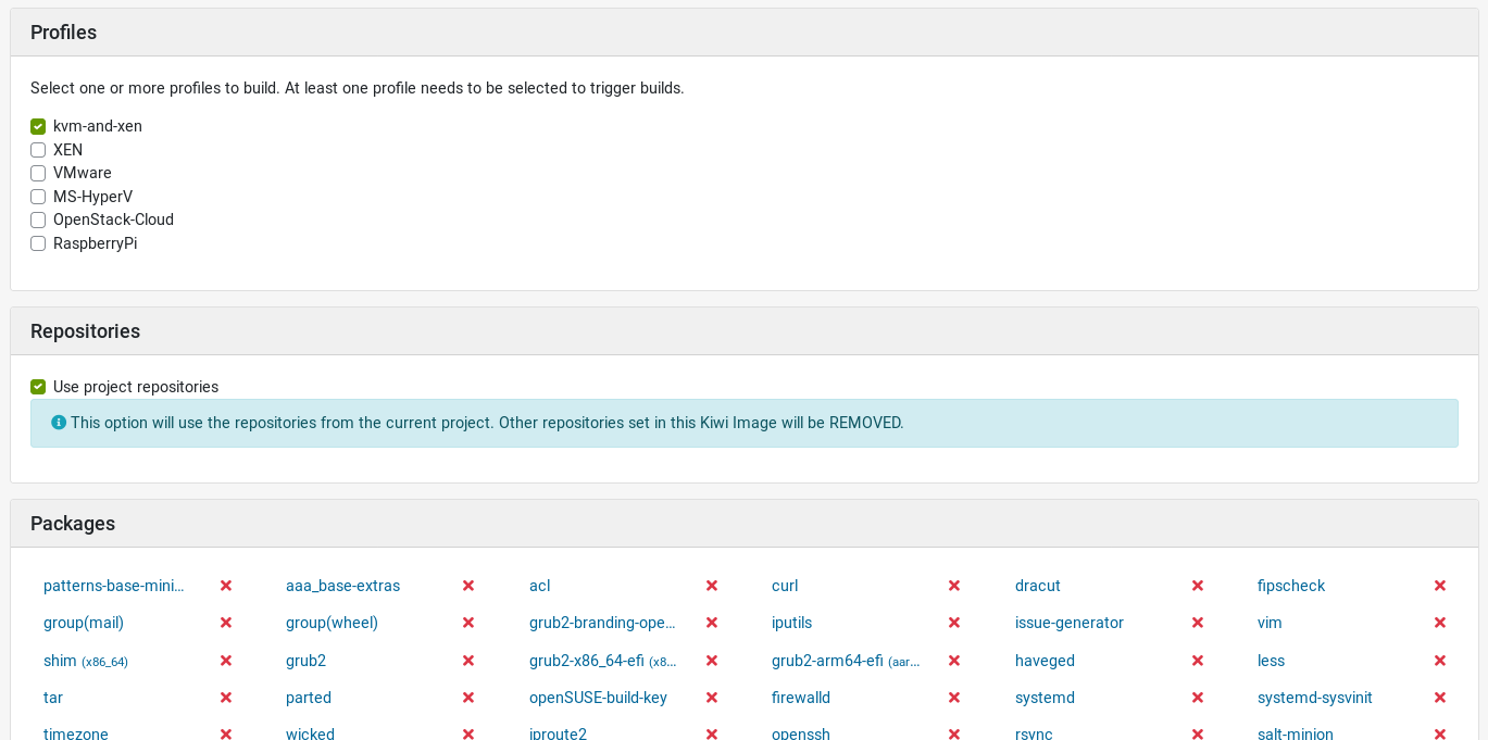
The Kiwi Editor was almost entirely migrated by @hellcp. He did a great job! Only a few tweaks were needed to complete migration.
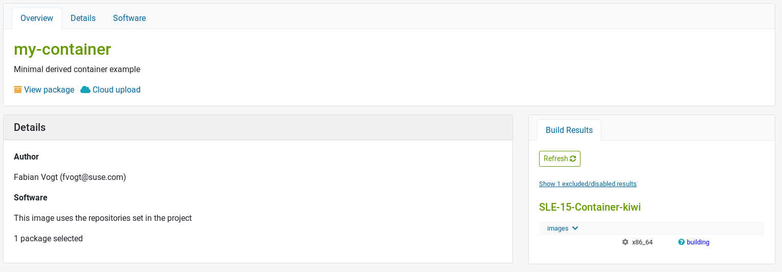
This migration also introduces some improvements in the UI, like the packages list which is now orderly. Thanks to @hellcp for his contribution.
Contribution Graph
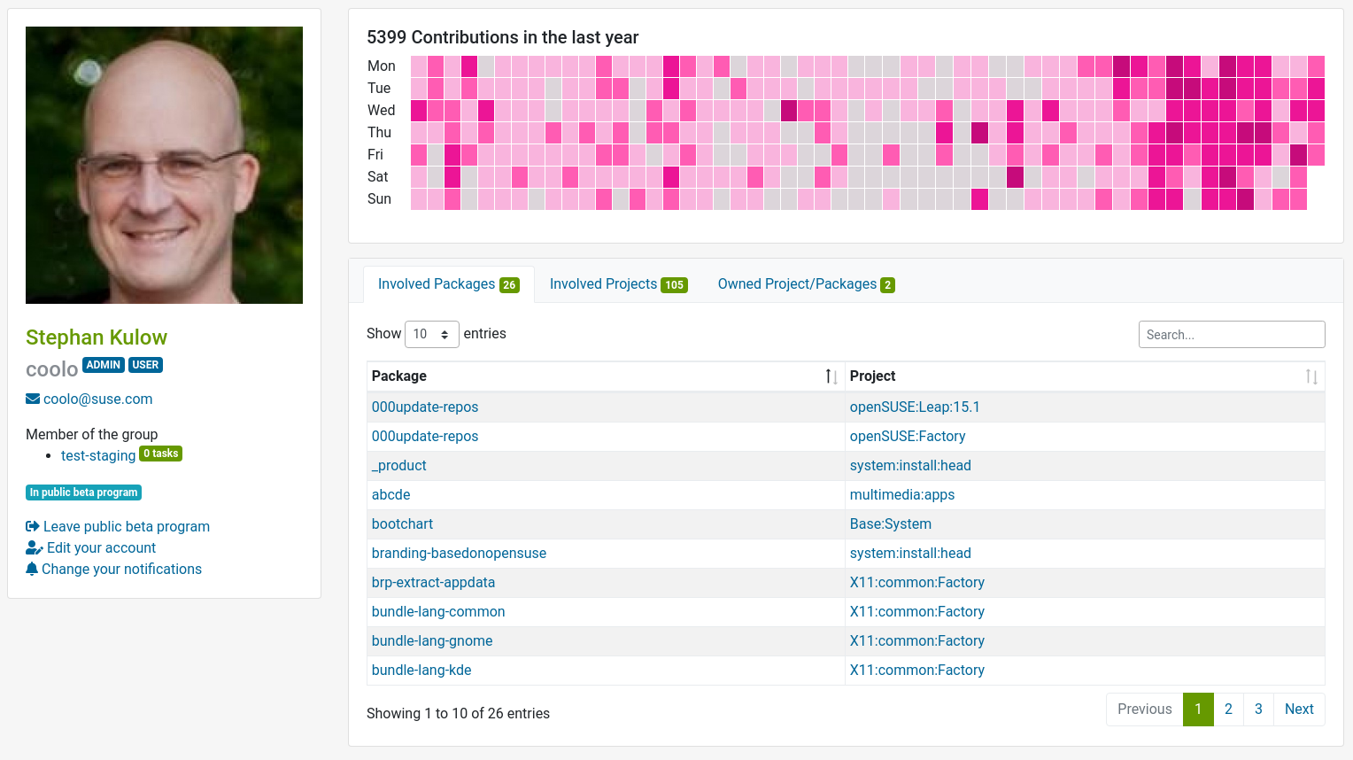
@coolo and @Ana06 worked on an awesome contribution graph to show an overview of a user’s contributions. These include requests, comments and reviews. This new feature is on the user profile page.
Fixed Issues
We now display the review box only for requests which can be reviewed.
Error messages are displayed on the groups/users pages when something goes wrong. It wasn’t the case before whenever adding users/groups.
We migrated the modal to submit/revert a revision on the revision diff page.
How to Give Us Feedback
As always, we need your feedback to make this even better. Don’t forget to join the beta program, try the new user interface and tell us what you think about it. Please read the How Give Us Feedback section in this previous announcement. We are looking for:
- Bugs, so anything breaking workflows.
- Design feedback, so anything related to the user experience and interface.
- How it works on your device / browser.
