Revamped User Interface for Project, User and Group Pages
This is part 2 of a series of posts about revamping the user interface of OBS. We started off with the Package pages in October 2018, moved on to the Project, User and Group pages in December 2018, continued with the Request pages in February 2019 and migrated the Configuration pages in March 2019. We then finished the Maintenance pages in April 2019, the Search and Kiwi Editor pages were completed in May 2019. In June 2019 we focused on the Cloud and Monitor pages. The whole migration was finished in September 2019, bye bye bento!.
We are moving forward in the user interface revamp! ![]()
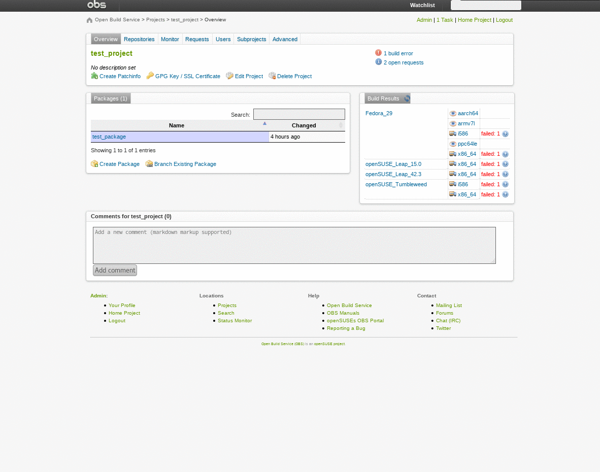
Here is a comparison of the old and new user interface of the project overview page:
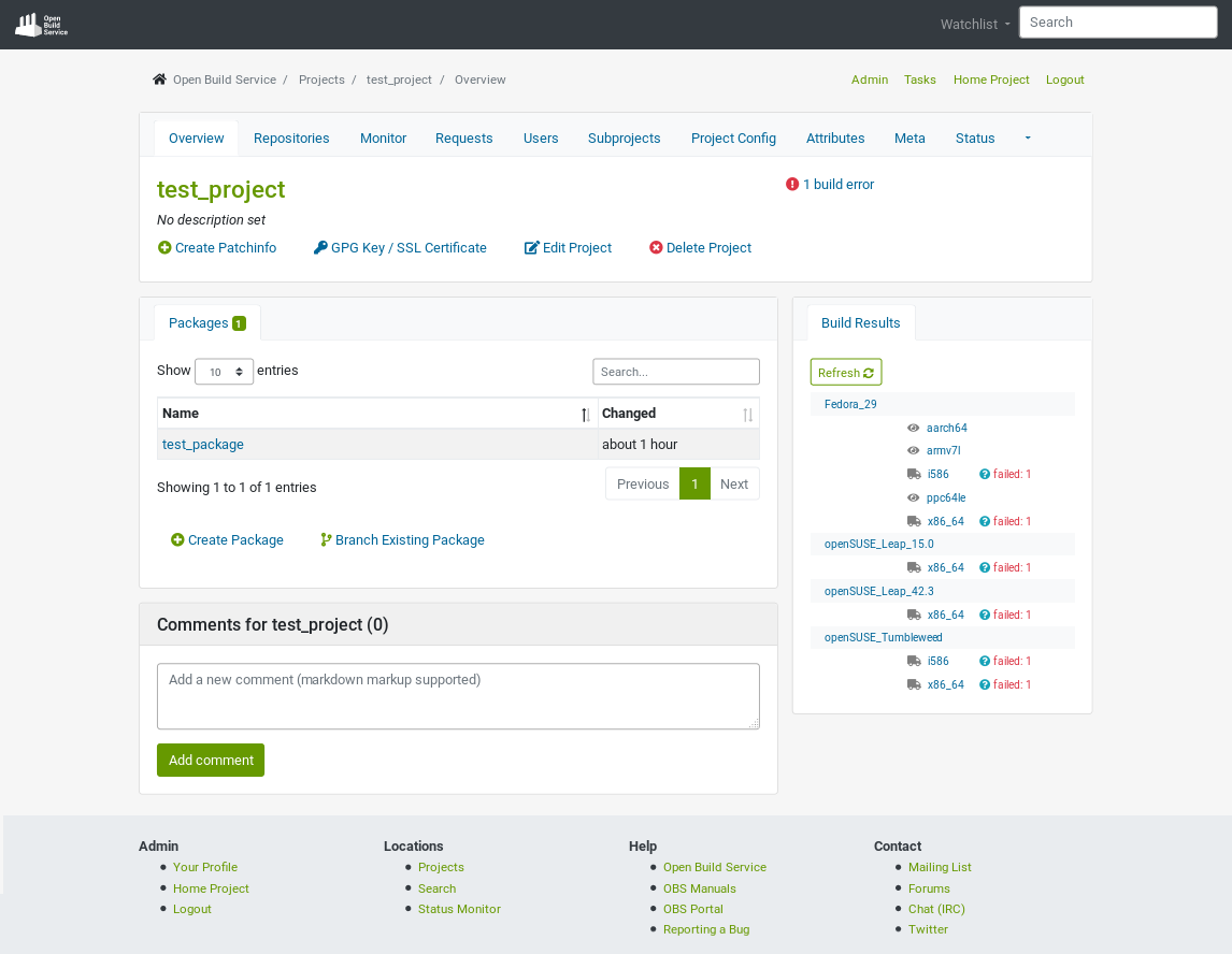
The New Pages
All the new pages now have a new design and work on your phone! ![]() Some of them were completely re-designed in order to optimize the space and improve usability.
Some of them were completely re-designed in order to optimize the space and improve usability. ![]() You may notice the difference between the old and the new user interface in those cases.
Please pay special attention to them: the repositories and pulse pages.
Your feedback is going to be very helpful, especially for those pages.
You may notice the difference between the old and the new user interface in those cases.
Please pay special attention to them: the repositories and pulse pages.
Your feedback is going to be very helpful, especially for those pages.
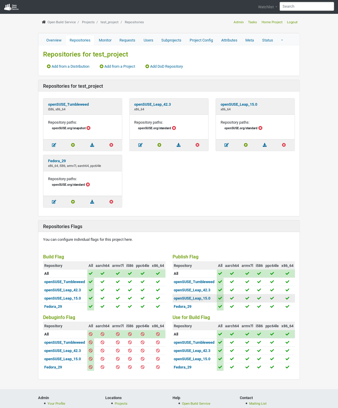
The Repositories Page
This page has been the one that has more significantly changed. We have moved the links to add repositories to the top (where they are easy to find) and added the Add from a Project option, which used to be in the Add Repository from Distribution page and called Expert mode. In addition, repositories are now showed in cards, where the information is condensed and nicely displayed. Last but not least, the edit options are in independent modals that appear in the center of the screen instead of mixed with the displayed information.
This is how the new beautiful Repositories for project page looks like:
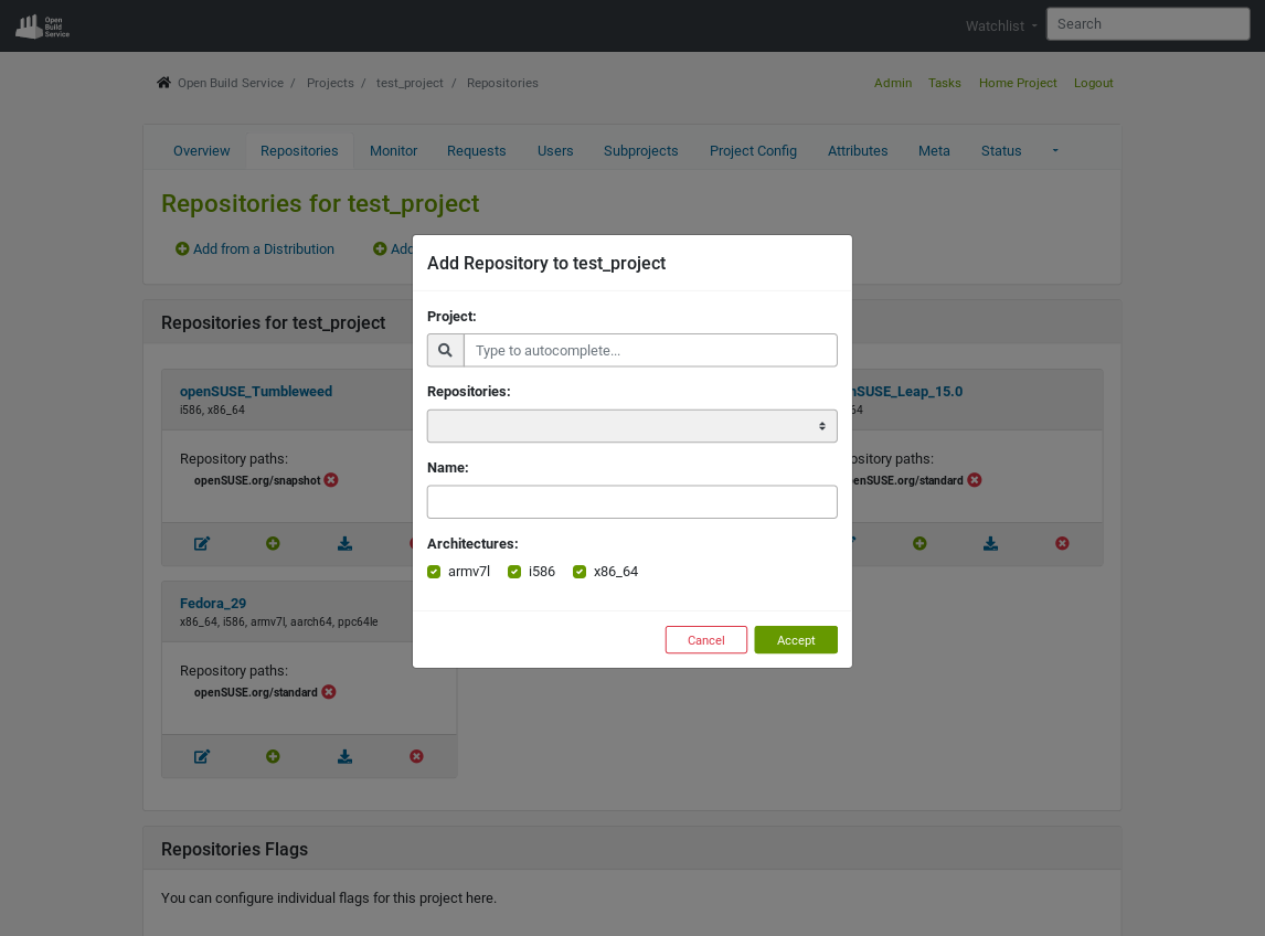
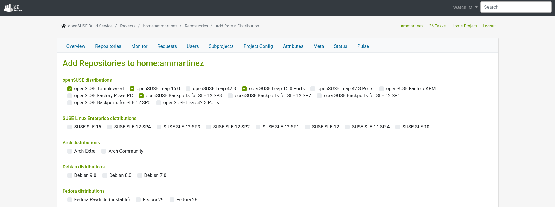
The Add Repository from Distribution page looks very similar to the old one, but without the Expert mode link:
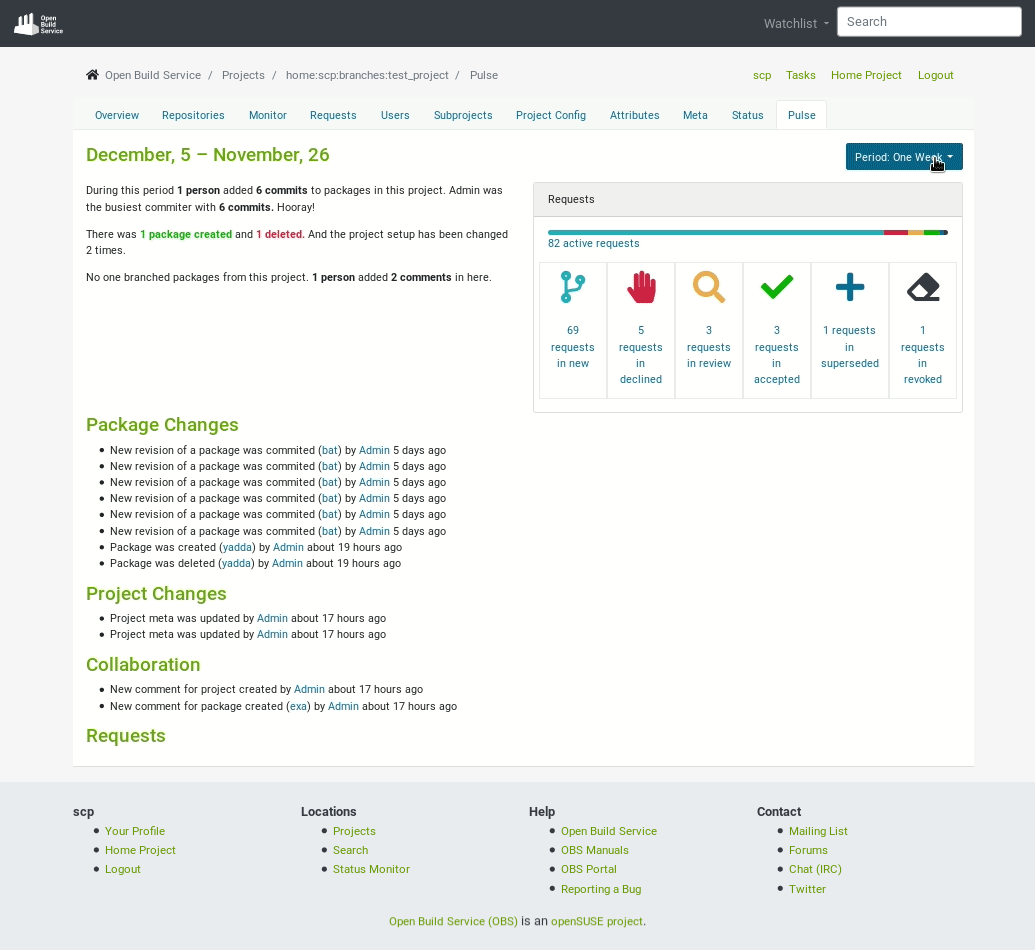
The Pulse Page
The pulse page has better visual cues and it is organized in sections. ![]() It also allows you to decide the period of time to visualize.
Check how different the page looks:
It also allows you to decide the period of time to visualize.
Check how different the page looks:
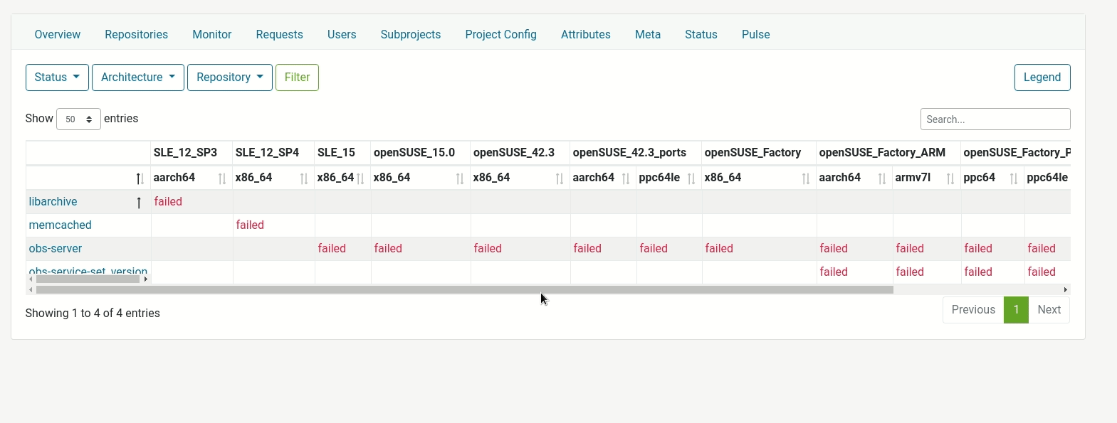
The Monitor Page
The old version of this page looks broken because the build status table overflows and breaks the layout.
The new page does not only fix this bug, but it provides more functionality as well.
The columns are sortable, with a client-side search, pagination and a legend. ![]() This is how it looks:
This is how it looks:
And Much More
The rest of the pages keep the same structure, but with a new look and feel.
The following images summarize the major changes, but go ahead and try it yourself! ![]()
The overview of a project:
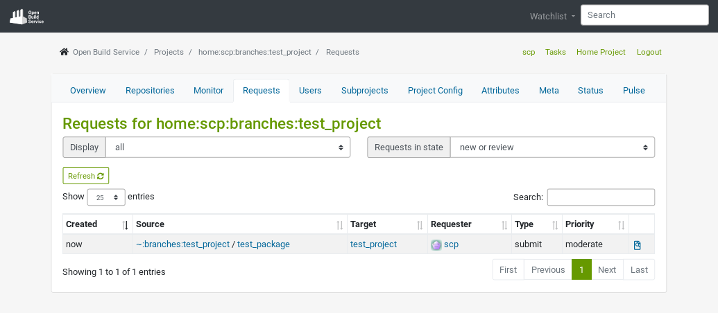
The requests of a project:
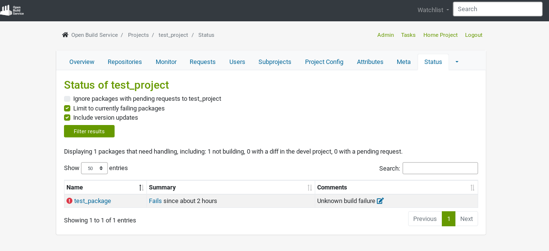
The status of a project:
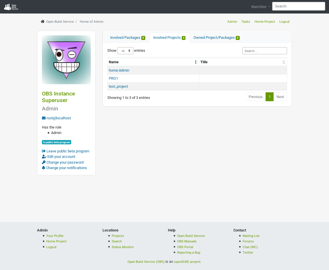
The overview of a user:
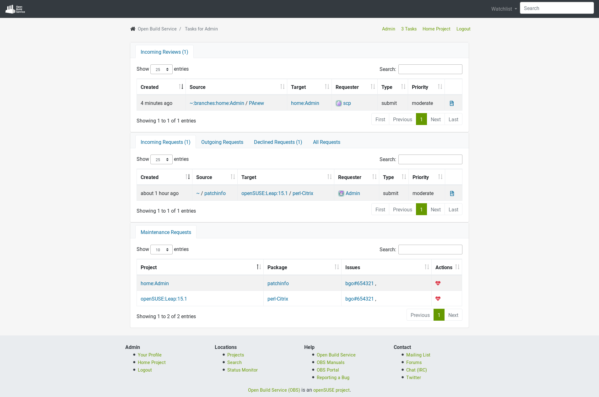
The tasks of a user:
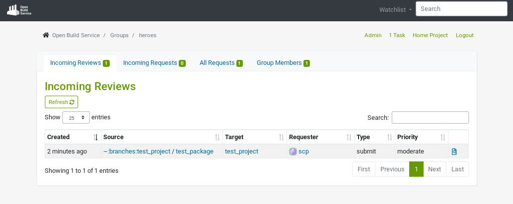
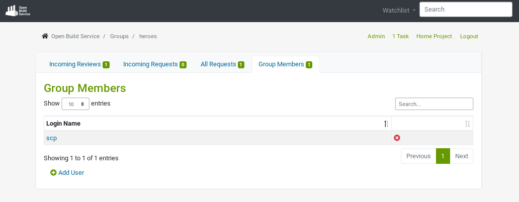
The overview of a group:
How to Give Us Feedback
As always, we need your feedback to make this even better. Don’t forget to join the beta program, try the new user interface and tell us what you think about it. Please read the How Give Us Feedback section in this previous announcement. We are looking for:
- Bugs, so anything breaking workflows.
- Design feedback, so anything related to the user experience and interface.
- How it works on your device / browser.
What Is Coming Next?
We will be working next on the Request pages. Stay tuned, we will inform you as soon as it is available in the beta program.
We are looking forward to hearing from you on GitHub and in the #opensuse-buildservice IRC channel on Libera.Chat!