New Navigation Design Ready to Come Out!
After a few months in the beta program, we’re ready to roll the navigation redesign out of beta, making it available to all OBS users.
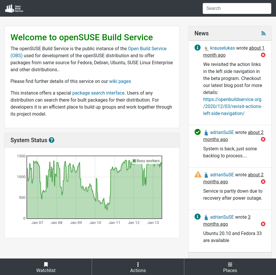
As we say, a picture is worth a thousand words:
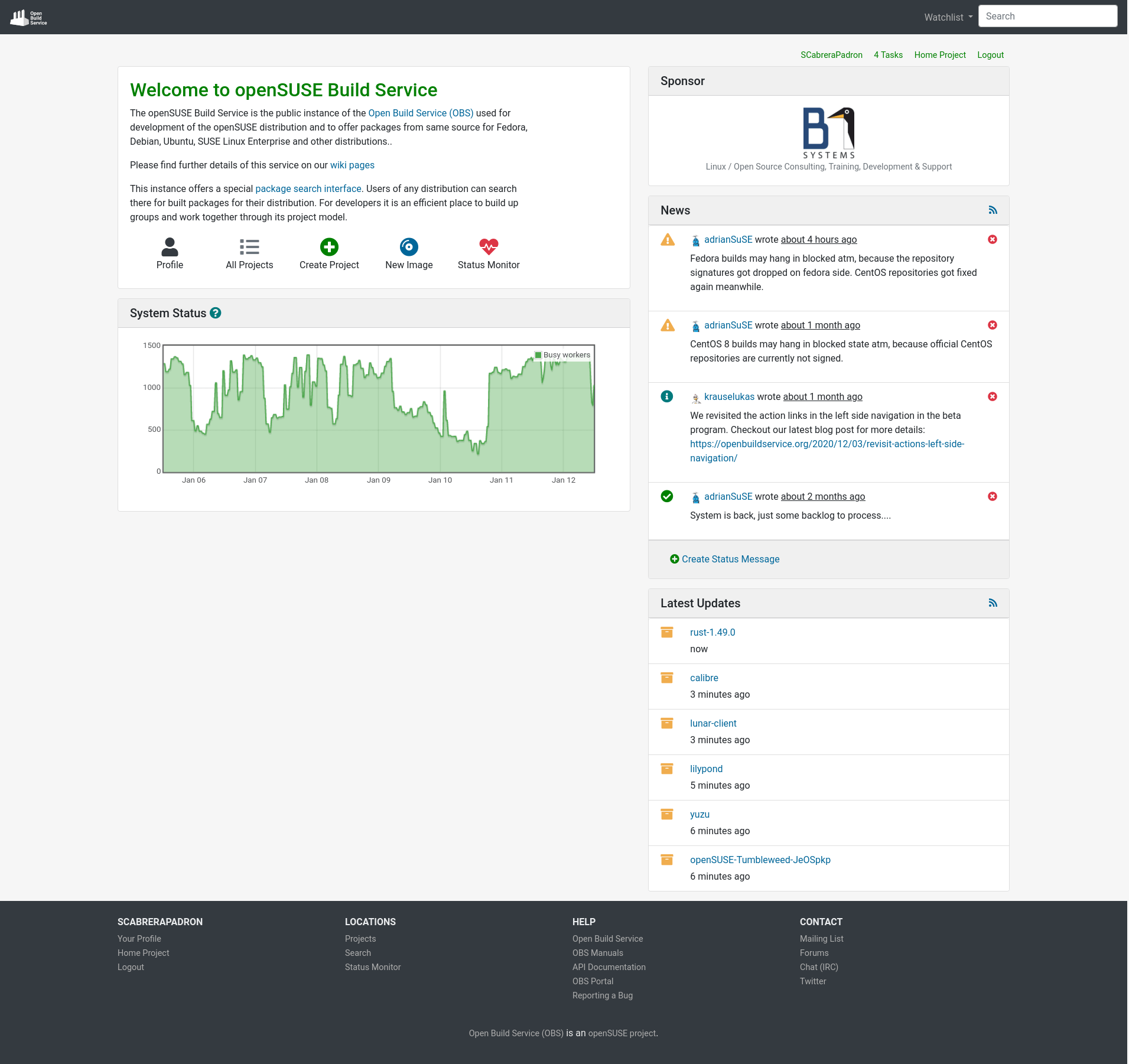
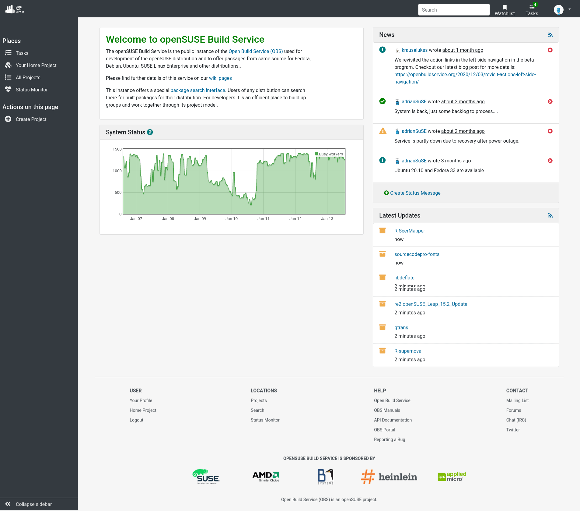
The redesign introduces changes mostly in the navigation areas. The top bar includes links closely related to the user like their profile or their watchlist. The left sidebar contains links to both relevant places inside OBS and actions on the current page.
Moreover, we encourage you to use OBS from your tablet or smartphone, the layout and the navigation areas have also been revamped to offer the best user experience possible for small screens.
Thanks to the valuable feedback provided by the users in our beta program, we have come up with this solution that tries to provide a more user-friendly and intuitive interface for OBS. We invite you to have a look at the blog posts we published from the beginning of this journey to nowadays:
- More Responsive Than Ever Before!
- Who Said OBS Was Not Responsive?
- Fresh Notifications and Much More
- Where Are My Package Actions?
- Left Side Navigation
- Navigation and Profile Page Redesign section “To Collapse, or Not To Collapse?”.
- Revisit Actions in the Left Side Navigation
As you can see in the blog entries and screenshots, this is not all about navigation. You will find, among others, the following changes in the redesigned responsive layout:
- Build Results area redesign for responsiveness.
- Replace forms in modals by inline forms.
- Responsive tables.
- Footer redesign.
- Sponsors moved to the bottom of the page.
- In-place editing.
- Scrollable tabs.
- Actions moved to the proper place.
How To Give Us Feedback
There are two ways to reach us:
- On GitHub, by opening an issue and / or commenting on an already opened issue.
- On IRC, by talking directly to us. We are in the channel
#opensuse-buildserviceon Libera.Chat.
Please note that we favor GitHub to gather feedback as it allows us to easily keep track of the discussions.