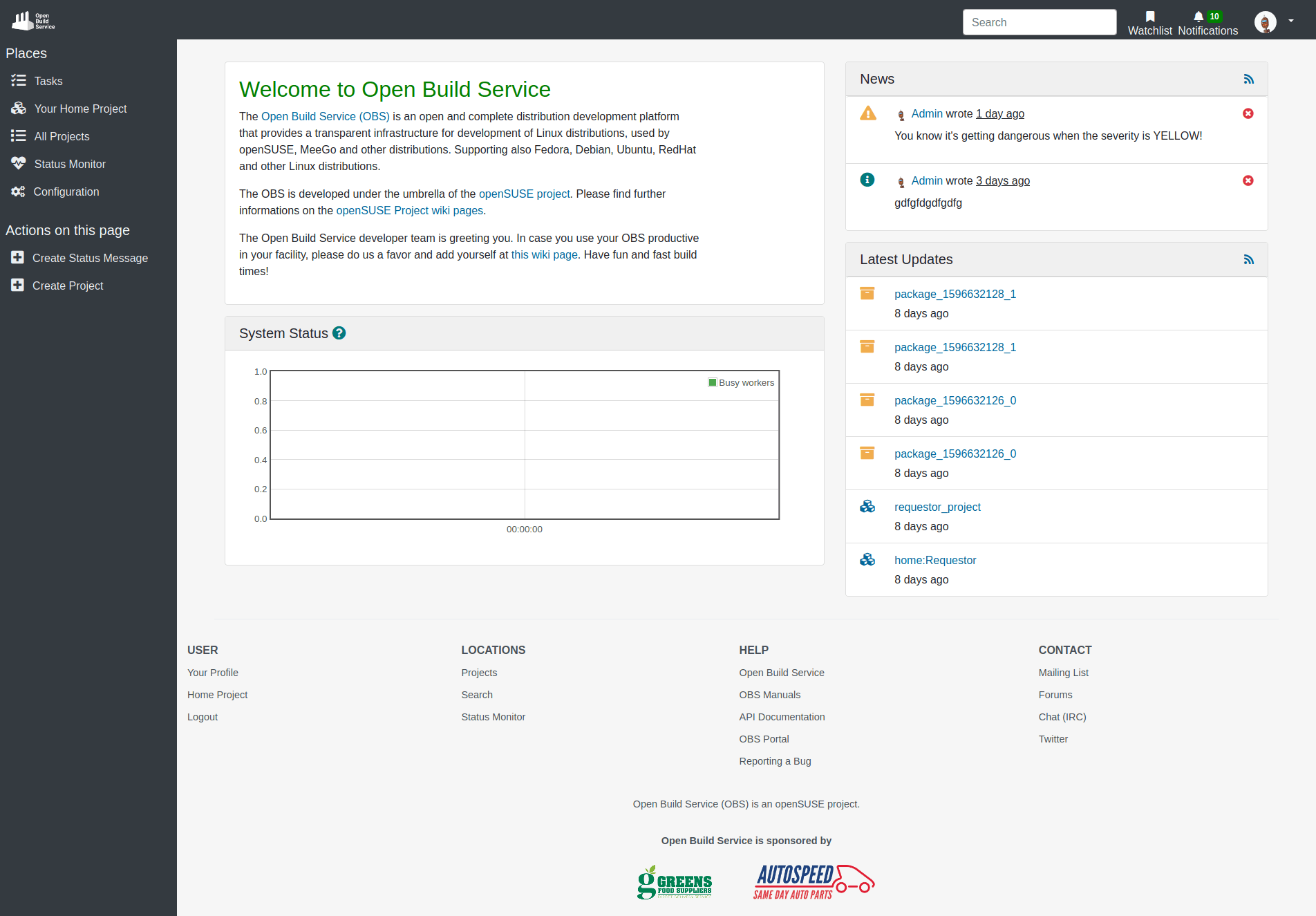
Left Side Navigation
Considering the feedback provided by those of you enrolled in our beta program, we came up with another revised navigation structure. The new design displays the main navigation elements on a fixed left column where the options are always visible. We believe this solution brings many advantages and is more intuitive and user-friendly than before.
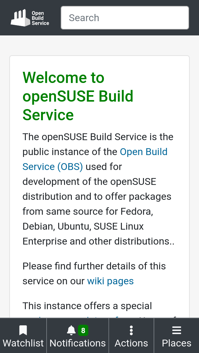
Mobile Navigation 👍
After a few weeks of using the actions/places menus and listening to your feedback, we concluded that the proposed mobile navigation bar fulfilled your needs; it always stays visible, reduces the need for scrolling and clicking small targets.
Desktop Navigation 👎
On the contrary, displaying the same kind of menus at the top on bigger screen sizes did not result in the same level of usability.
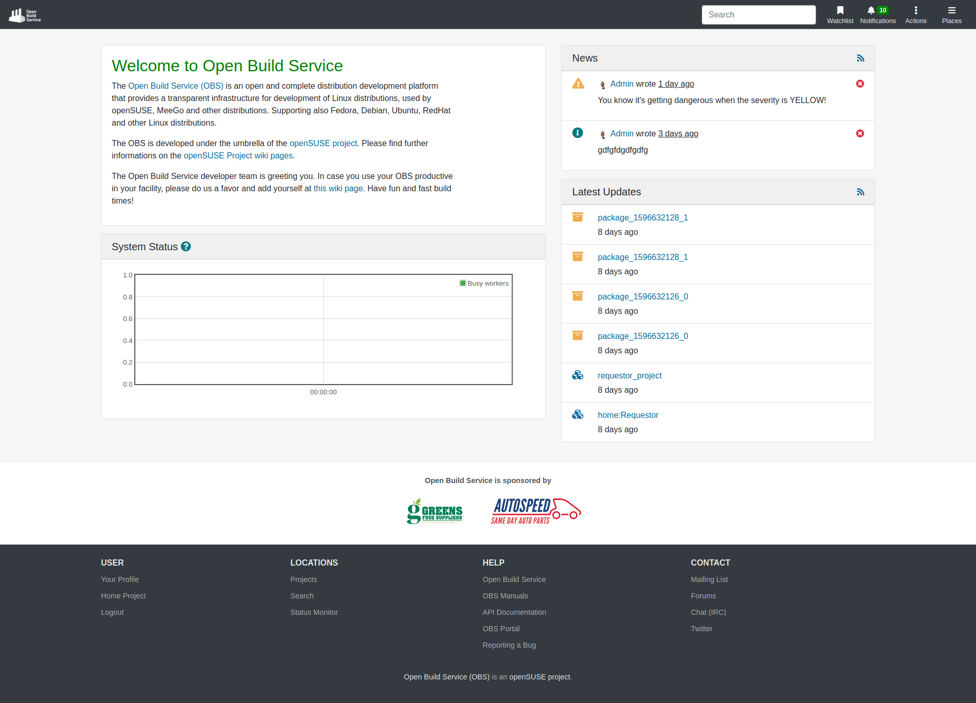
It hides the actions and links to relevant places from the screen. That increased the number of clicks needed to perform an action but also the number of selection errors since you had to remember in which menu which things are.
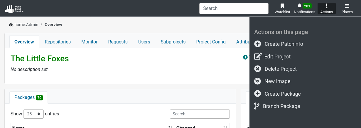
Keeping in mind that there is a need for speed when you navigate the OBS interface. The faster it is for you to find what you are looking for, the more time you will save on your task. With the new solution, all the options for Actions and Places are always visible and we only need one click to reach them.
The previous version also made navigation rather slow; it required much cursor movement over the screen, from the content to the top bar. The new proposal, on the contrary, takes advantage of the excess of white-space in the page and introduces a fixed left column containing the main navigation elements. The options are now closer to the content.
And last but not least, people believed the previous design was not intuitive enough since it did not follow a widely used interface pattern. That has been solved by following a well-known dashboard interface pattern, which makes navigation a lot more intuitive and usable for every OBS users.
How to try the new navigation?
Visit OBS from a desktop-size screen and join the beta program. The main page together with the project and package pages are good ones to try the new navigation structure.
Don’t forget to tell us what you think. We are looking for:
- Bugs, so anything breaking workflows.
- Design feedback, so anything related to the user experience and interface.
- How it works on your device / browser.
How To Give Us Feedback
There are two ways to reach us:
- On GitHub, by opening an issue and / or commenting on an already opened issue.
- On IRC, by talking directly to us. We are in the channel
#opensuse-buildserviceon Libera.Chat.
Please note that we favor GitHub to gather feedback as it allows us to easily keep track of the discussions.