From showing what happened, to showing what matters.
It’s time again to talk about the notifications. On our journey to a full-fledged notification system, we put our emphasis on the content of the notifications and kept improving several UI parts to increase productivity and user experience.
Until now, a notification just reflected the occurrence of an event in which you were involved. This can be a response to a comment, a open request that got accepted or a review that is wanted from you. The problem with showing a chronological list of events, do you still care about the state of your request from one week ago, that meanwhile changed four times? Most likely not, that is why we worked hard to move from an event based flow, to an actual notification system that only shows what really matters. Instead of producing new notification records for every single event, we keep notifications related to a certain notifiable(can be a comment or request) up-to-date. The review wanted notifications are now unified with the request ones. Since the current state is always reflected, it will reveal when a review is required by you or someone else.
Badges are indicating the current state (e.g. new, superseded or accepted etc.) of the associated request. A state change of the request will be
reflected, by the badge. The avatars of users and groups will tell you, who else is involved since the
last time you read the notification.
![]()
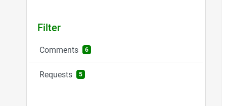
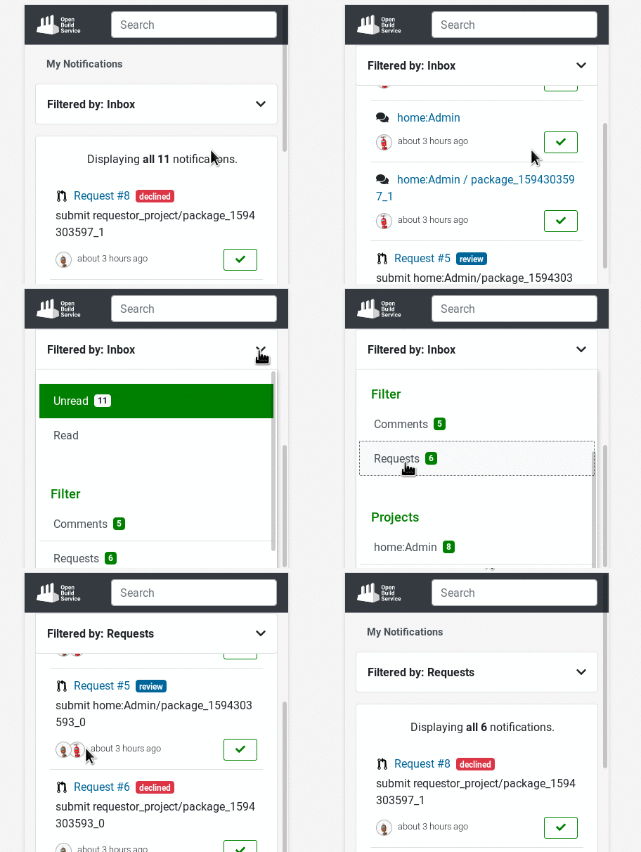
On the design side of things, there were several improvements that rounds out existing components and and increases the responsiveness. The counters that previously got introduced on the projects filter are now shown on all remaining filter selectors, giving you a hint at first glance, which kind of notifications are pending.

Marking a notification as read won’t cause full page reload from now on. We only refresh the parts that need to be refreshed. This saves unnecessary loading times and leads to a better overall experience while scrolling through the items.
Smaller viewports benefit from a sticky filter section. No need to always scroll back to the top of the page in order to apply another filter. The filter section will simply follow, while strolling through your notifications. Additionally, the chosen project filter is now displayed after selecting it from the dropdown menu.

How To Give Us Feedback
There are two ways to reach us:
- On GitHub, by opening an issue and / or commenting on an already opened issue.
- On IRC, by talking directly to us. We are in the channel
#opensuse-buildserviceon Libera.Chat.
Please note that we favor GitHub to gather feedback as it allows us to easily keep track of the discussions.
